
Updated March 26, 2026
TL;DR: Constraints are not limitations. They are the design system.
- Every rule exists to make passes work — not to frustrate designers
- Fixed layouts force information hierarchy
- System typography forces focus on content
- Limited interaction forces clarity instead of cleverness
- Design within them, and your passes work everywhere
Overview
Constraints are not limitations. They are the design system.
Every rule Apple and Google enforce — fixed layouts, limited fields, controlled typography — exists to make passes work. Not to frustrate designers. Not to limit creativity. To ensure that every pass, from every issuer, scans reliably, displays clearly, and earns user trust.
When you understand why constraints exist, you stop fighting them. You start designing with them.
Why are wallet passes designed to be predictable
Wallet passes are meant to be understood instantly. When a user opens their wallet, they already know where to look, they already understand how a pass behaves, and they don't need to learn your design.
This predictability only works because customization is bounded. Unlimited freedom would break consistency — and consistency is the foundation of trust.
What is the difference between customization and control
A useful way to think about wallet passes: you configure a pass, you do not design a layout system.
The operating system owns structure, typography, spacing, and interaction patterns. You control content, priority, meaning, and updates over time. That division of responsibility is deliberate.
What can you customize in a wallet pass
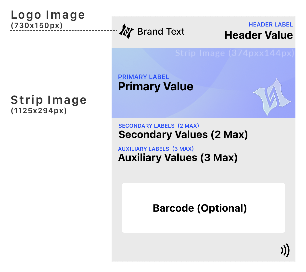
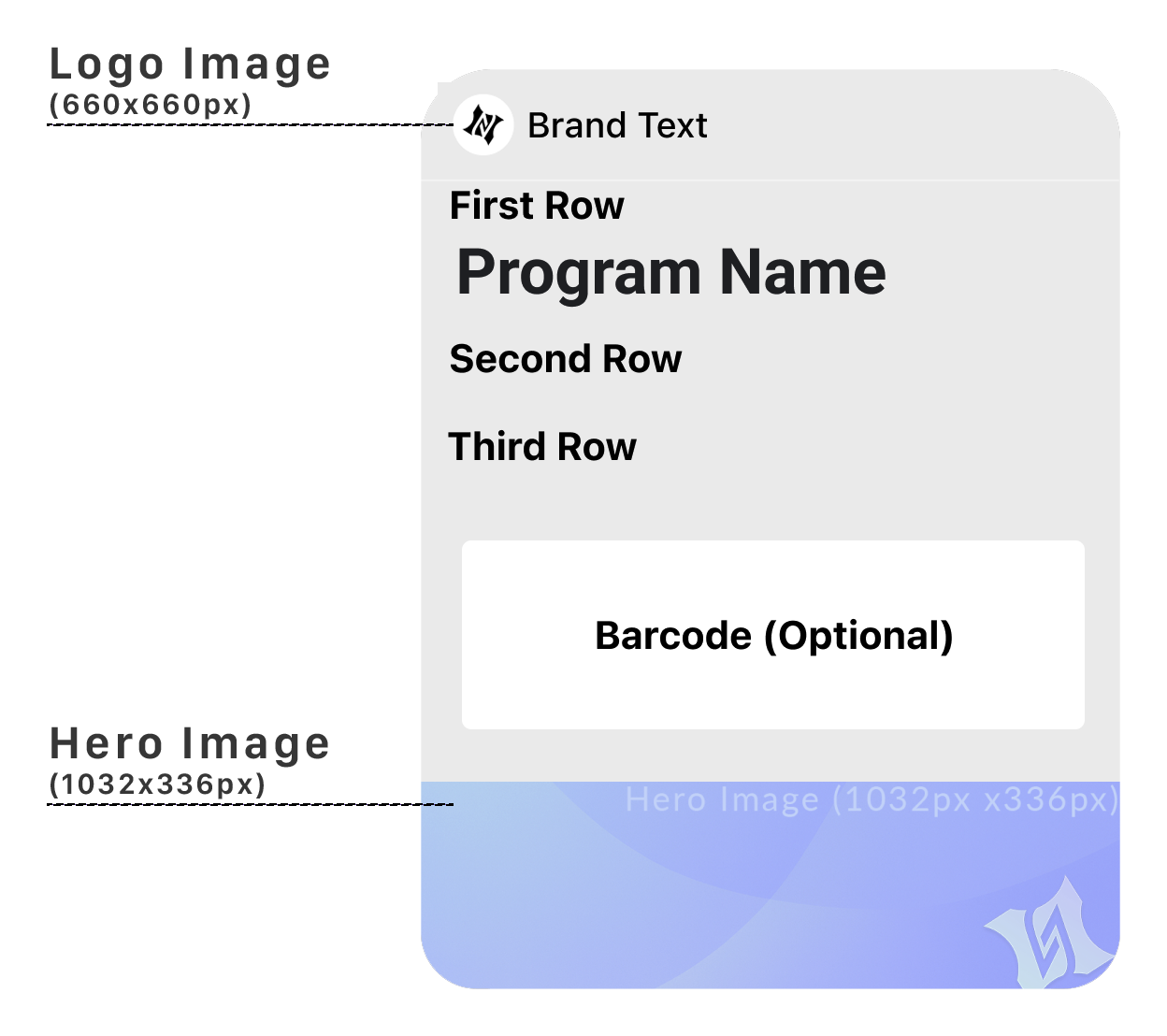
Wallet platforms give you meaningful — but focused — control.
You can typically customize text content including titles, labels, values, messages, and metadata. Visual identity is available within limits: background colors, foreground colors, logos, and images. You control primary vs secondary information — what is emphasized, what is supporting, what is tucked away. Dynamic data like status, balance, points, access state, expiration, and messaging are all configurable. Behavior over time including updates, notifications, and relevance changes are within your control.
This is where great wallet pass design actually lives.
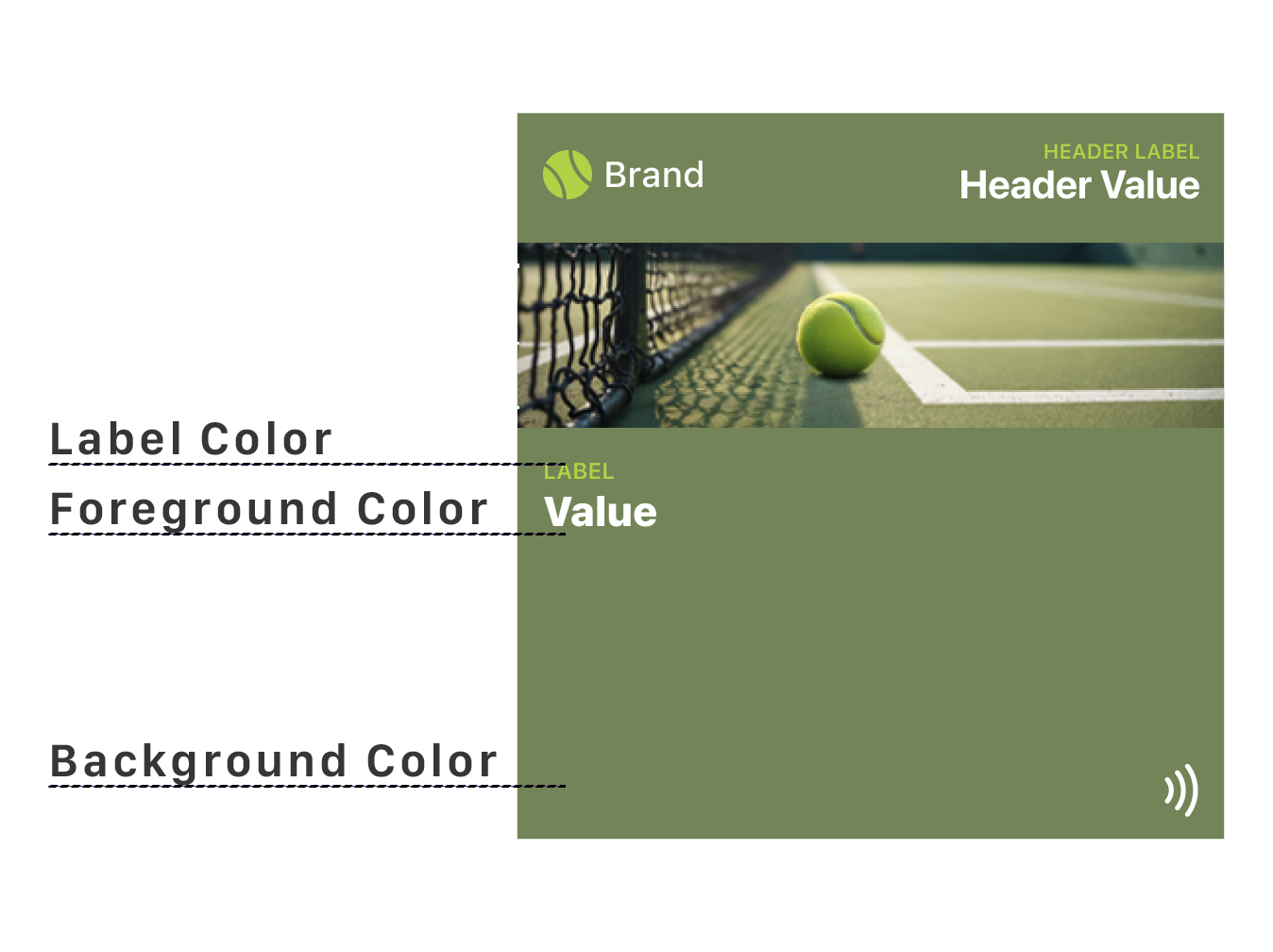
How does color customization differ between platforms
Color is one of the most visible customization options — but it works differently on each platform.
Apple Wallet allows three color settings: background color, label color, and foreground (value) color. This gives you meaningful control over visual identity while maintaining readability. You can create contrast between labels and values, or keep them unified for a cleaner look.
Google Wallet is more restrictive. You can only set the background color. The text color adapts automatically based on the background you choose — the system ensures sufficient contrast for readability. You cannot override this behavior.
On both platforms, the system prioritizes legibility. If your color choices would compromise readability, the platform may adjust or override them. Design with contrast in mind, and always test on real devices.
How does text behave in wallet passes
Typography in wallet passes is controlled by the operating system, not by you. Both platforms use their native system fonts — San Francisco for Apple Wallet and Google Sans for Google Wallet. You cannot change the font family, weight, or style.
What you can influence is content length and hierarchy. Both platforms dynamically adjust text size based on how much content you provide. Shorter text appears larger and more prominent. Longer text shrinks to fit the available space. If content is too long, it truncates with an ellipsis.
Apple Wallet has a distinctive formatting behavior: labels are automatically displayed in ALL CAPS, while values appear in normal sentence case. This creates a clear visual hierarchy between the label (what the field is) and the value (what it contains). You do not control this — it happens automatically. Writing labels in lowercase is recommended since the system handles capitalization.
Google Wallet does not apply automatic capitalization. Labels and values appear exactly as you provide them. This gives you more control but also more responsibility to maintain consistent formatting.
For text alignment, Apple Wallet offers three options: left, center, and right. Google Wallet generally aligns text based on the field type and position. Neither platform allows vertical alignment adjustments — the system places text where it belongs.
The practical takeaway: write concise content. Every extra character reduces readability. Test your passes with real content, not placeholder text, to see how the system handles your actual data.
For a deeper dive into Apple Wallet text behavior, see Designing Apple Wallet Passes: Text Alignment, Layout and Behavior.
What can you not customize in a wallet pass
Just as important is what you cannot change.
You generally cannot redesign the layout grid, move fields arbitrarily, use custom fonts, add custom buttons or UI components, create multi-step interactions, or override system placement or surfacing rules.
These are not missing features — they are deliberate exclusions.
Why is the layout fixed
Layout consistency allows users to scan passes instantly. A ticket always looks like a ticket. A card always looks like a card. An offer always looks like an offer.
This allows faster recognition, fewer mistakes, and lower cognitive load. If users have to figure out your pass, the design has already failed.
Why is typography locked
System typography is optimized for legibility in motion, accessibility, small-glance reading, and cross-language support.
Allowing custom fonts would reduce readability, create accessibility risks, and break visual consistency. Voice comes from language and hierarchy, not typography.
Why are interactions minimal
Wallet passes are built for moments, not journeys. Typical interactions are scan, tap, confirm, and dismiss. They intentionally avoid browsing, exploration, configuration, and multi-step flows.
If your experience requires navigation, it belongs in an app — not a pass.
What is the summary of what you can and cannot do
| You Can Do | You Can't Do |
|---|---|
| Define content | Redesign layout |
| Emphasize key info | Move fields freely |
| Update data in real time | Add custom UI |
| Set brand colors | Use custom fonts |
| Control messaging | Control OS surfacing |
| Design for updates | Design interactions |
This table alone resolves most confusion early.
Why are updates the escape hatch
What wallet passes lack in interaction, they gain in state changes. Instead of asking users to tap, the pass updates itself, the system surfaces it when relevant, and the information stays current without effort.
This is the superpower most teams underuse. Design passes as living objects, not static cards.
How do constraints create better design
Wallet pass limitations force clarity, reward simplicity, and penalize noise. They remove unnecessary decisions and focus design energy on what actually matters: the right information, at the right time, in the right context.
How should you reframe the question
Instead of asking why you can't customize more, ask what the user needs to understand instantly in this moment. That question leads to better passes — every time.
The Shift
Stop asking "what can't I do?" Start asking "what must I do well?"
The constraints aren't obstacles. They're the architecture. Design within them, and your passes will work everywhere, on every device, in every context.
That's not a limitation. That's the power of the system.
More articles in Foundations
Most teams design wallet passes wrong. Not because they lack skill — because they bring the wrong...
Designing for Pass UpdatesA customer just made a purchase. They open their wallet. The loyalty balance is the same as yeste...
How Wallet Passes Are Surfaced by the OSA wallet pass that's never surfaced is a wallet pass that doesn't exist.
Information Hierarchy in Wallet PassesYou have one second.
Interaction Design in Wallet PassesIn wallet passes, interaction design is not about what users do. It's about what the system does ...
Introduction to Designing Wallet PassesThe design looked perfect in Figma. Clean layout. Beautiful typography. Exactly what the brand wa...
Wallet Pass Design Principles ChecklistEvery failed wallet pass violates one of these principles. Every successful pass embodies them.
Wallet Passes vs Apps vs WebsitesApps invite exploration. Websites enable discovery. Wallet passes demand instant recognition.