
Updated March 26, 2026
TL;DR: Apple controls typography — you control meaning.
- Alignment affects text inside fields, not field position
- Pass style determines field stacking behavior
- Text truncates automatically — design for what gets cut
- Font size adjusts dynamically — your mockup lies
- Event tickets allow row control — use it deliberately
Overview
You cannot control how text looks in Apple Wallet. You can only control what it says.
This is not a limitation to work around. It's a design discipline to embrace.
Apple controls font, size, alignment behavior, and truncation. Your job is simpler and harder: choose what deserves primary position, what supports it, and what survives being cut off.
What most teams get wrong
Teams spend hours on typography decisions that Apple Wallet will ignore:
- Custom fonts → Apple uses system fonts
- Precise sizing → Apple sizes dynamically
- Exact alignment → Apple aligns based on field position
Then they're surprised when their "design" renders differently than their mockup.
The mistake is thinking typography is a design decision. In Apple Wallet, typography is a system behavior. You influence it through structure, not style.
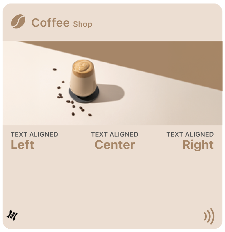
Alignment: what it controls and what it doesn't
Each field can include a textAlignment setting: Left, Center, Right, or Natural (follows language direction). These settings only affect how text appears inside the field box — they do not move the field itself.
Setting a field to Right alignment pushes the label and value to the right edge of its box, but the box stays in its default position. Field placement is determined by the order of fields in the pass definition, not by alignment settings.
Use alignment to fine-tune visual balance, not to reposition content.
Field stacking: pass style determines behavior
You cannot drag fields into new positions. You choose which array each field belongs to — primary, secondary, auxiliary, or back — and Apple's renderer decides placement.
How Apple stacks fields:
- Primary fields → the bold row in the center
- Secondary fields → directly beneath primary, usually 1–2 side-by-side
- Auxiliary fields → same horizontal band as secondary, or below depending on device width
- Back fields → only visible when you flip the pass
Apple's renderer optimizes space: on narrow screens, auxiliary fields may appear below secondary. On wider screens, they share the same band.
Why pass style choice matters more than you think
Different pass styles change how the same fields render:
- Coupon and Access passes stack secondary and auxiliary in separate rows
- Store cards often merge these fields into a single band
- Event tickets prioritize readability with vertical stacking
The same field configuration looks different depending on pass type. Choose a style that matches your layout goals, not just your use case.
Row control: the event ticket advantage
Event tickets offer unique control: auxiliary field row assignment. Each auxiliary field can be assigned to row 0 or row 1. Row 0 places the field in the first auxiliary row; row 1 places it in the second. Each row can display up to four fields side by side.
Use this to group related information: Date and Time in row 0, Section and Seat in row 1. Other pass styles do not support row control — Wallet decides layout automatically.
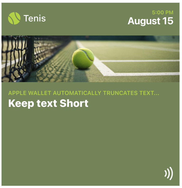
Truncation: design for what gets cut
Apple Wallet automatically truncates text that's too long. There's no wrapping or scrolling. Primary fields can hold around twenty characters; secondary and auxiliary allow fewer. The exact cutoff depends on layout and adjacent fields.
The truncation test: If your most important content gets cut off, the pass fails. Design labels to survive truncation. Use "Member ID" not "Membership Identification Number."
Dynamic sizing: why your mockup lies
Apple Wallet controls font size automatically. You cannot set custom fonts or sizes. The system adjusts text to fit the field box.
What affects size:
- Pass style — generic allows larger text; store cards compress aggressively
- Field count — when multiple fields share a row, text shrinks to balance
- Content length — longer values appear smaller; shorter values appear larger
This is why your Figma mockup doesn't match reality. Simulators may not match Wallet's behavior exactly. Always test on real devices.
How to design when you can't control typography
Accept what you can't control:
- Font family (system fonts only)
- Font size (dynamically adjusted)
- Exact alignment (determined by field position)
Focus on what you can control:
- What content goes in each field
- Which fields are primary vs supporting
- Whether content survives truncation
- Pass style selection
Use short, clear labels. Split information across arrays to avoid overcrowding. Place the most important data in primary fields. Test on actual devices.
The Shift
Stop designing typography. Start designing for truncation.
The question isn't "what font size should this be?" — Apple decides that. The question is "what happens when this gets cut off?"
If your pass still works when labels truncate, when values shrink, when the system rearranges your fields — you've designed for Apple Wallet.
If it only works with your exact mockup text — you've designed for Figma, not Wallet.
More articles in Platform Guides
Every design difference between Apple and Google Wallet traces back to one choice:
Apple Wallet Design System ExplainedApple Wallet is not a design tool. It is a policy engine.
Apple Wallet Layout AnatomyLayout in Apple Wallet is semantic, not spatial.
Designing One Pass for Two PlatformsDesigning one pass for two platforms sounds efficient. It's actually one of the hardest problems ...
Google Wallet Design System ExplainedGoogle Wallet doesn't hold credentials. It connects systems.
Google Wallet Layout Behavior & Visual FlexibilityGoogle Wallet's flexibility is not an invitation to design freely. Flexibility demands defensive ...