
Updated March 26, 2026
TL;DR: You don't design what the user sees. You design what the system can survive.
- Most teams design wallet passes like screens — and most fail
- Wallet passes are systems: defined once, issued thousands of times
- Every pass has two layers: structure (fixed) and data (variable)
- Three moments define success: surprise, validation, trust
- If your design depends on ideal data, it is already broken
The Mistake Everyone Makes
The design looked perfect in Figma. Clean layout. Beautiful typography. Exactly what the brand wanted.
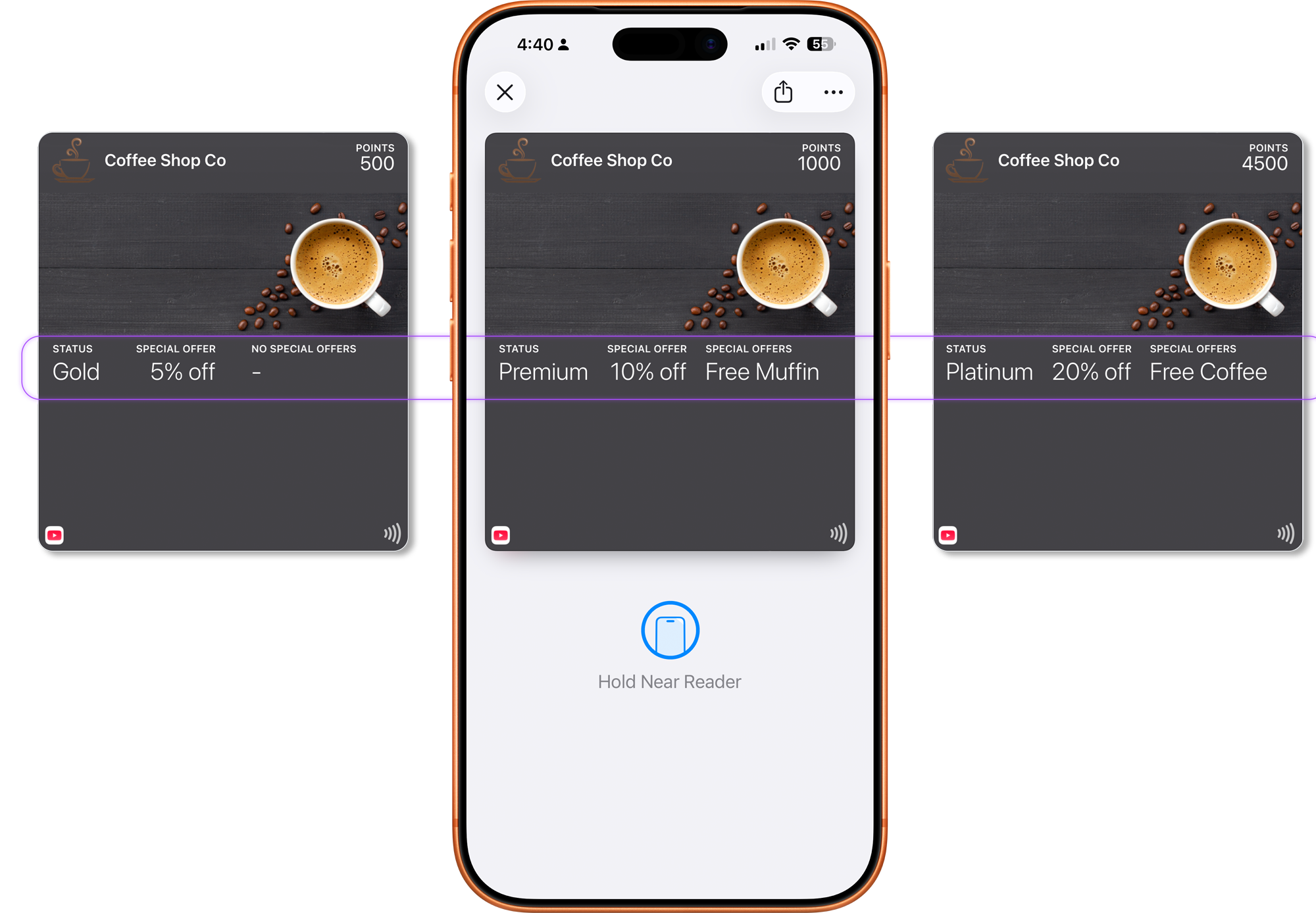
Then real data arrived.
"Alexandra Konstantinidis-Weatherington" instead of "John Smith." A 12-digit membership number. A loyalty balance with four decimal places. A status message that wrapped to three lines.
The layout broke. The text overflowed. The meaning disappeared.
Most wallet pass projects fail before they even start. Not because of technology. Not because of integrations. Because of one assumption:
"We just need to design the pass."
Wallet passes are not designed for one example. They are designed for thousands of real users, with unpredictable data and constantly changing states.
That's where the design breaks.

Wallet Passes Are Systems (Not Screens)
A screen is static.
A wallet pass is not.
A screen is rendered once and displayed as-is. A wallet pass is issued many times, updated continuously, and used in real-world situations.
A wallet pass is a system.
It must handle:
- Different users
- Different data lengths
- Different states over time
And it must do this reliably — without redesign.
You are not designing a single UI. You are designing a structure that must survive variation.
The Two Layers
Every wallet pass operates on two layers.
This is not just a conceptual distinction. It is how wallet passes actually work in production.
What Stays the Same (Structure)
This is the foundation of the system:
- Branding
- Layout structure
- Field labels
- Meaning
This is defined once and reused across all passes.
What Changes (Data)
This is what varies per user:
- Name
- Points or balance
- Seat or access level
- Status (active, used, expired)
This data changes constantly — sometimes many times per day.
Why This Matters
If your design depends on specific values to look correct, it will fail.
The structure must work regardless of what data is applied.
If your design only works with ideal data, it is already broken.
The Three Moments Every Pass Must Survive
Every wallet pass encounters three critical moments. Understanding these helps you design passes that work in practice, not just in mockups.
The Surprise Moment
Many passes are surfaced automatically on the lock screen, through notifications, or based on time or location. In this moment, the user did not ask for the pass. The pass must explain itself without prior context.
The Validation Moment
This is the most common interaction: showing a QR code, tapping NFC, or confirming status or entitlement. The user is not reading — they are verifying. Primary information must be unmistakable.
The Trust Moment
Wallet passes are trusted because they feel official. They update automatically, look system-native, and are hard to fake. Any confusion at this stage undermines confidence. Clarity always beats decoration.
Where Designs Break
Most teams mix structure and data.
They design layouts that:
- Depend on short names
- Assume fixed values
- Use visuals to carry meaning
This creates fragile systems.
When real data is applied:
- Text overflows
- Meaning is lost
- Layout becomes inconsistent
A design that works for one pass but breaks for ten is not a design — it's a prototype.
A design that depends on specific data is not scalable — it is conditional.
And conditional systems always fail at scale.
Screen Thinking vs System Thinking
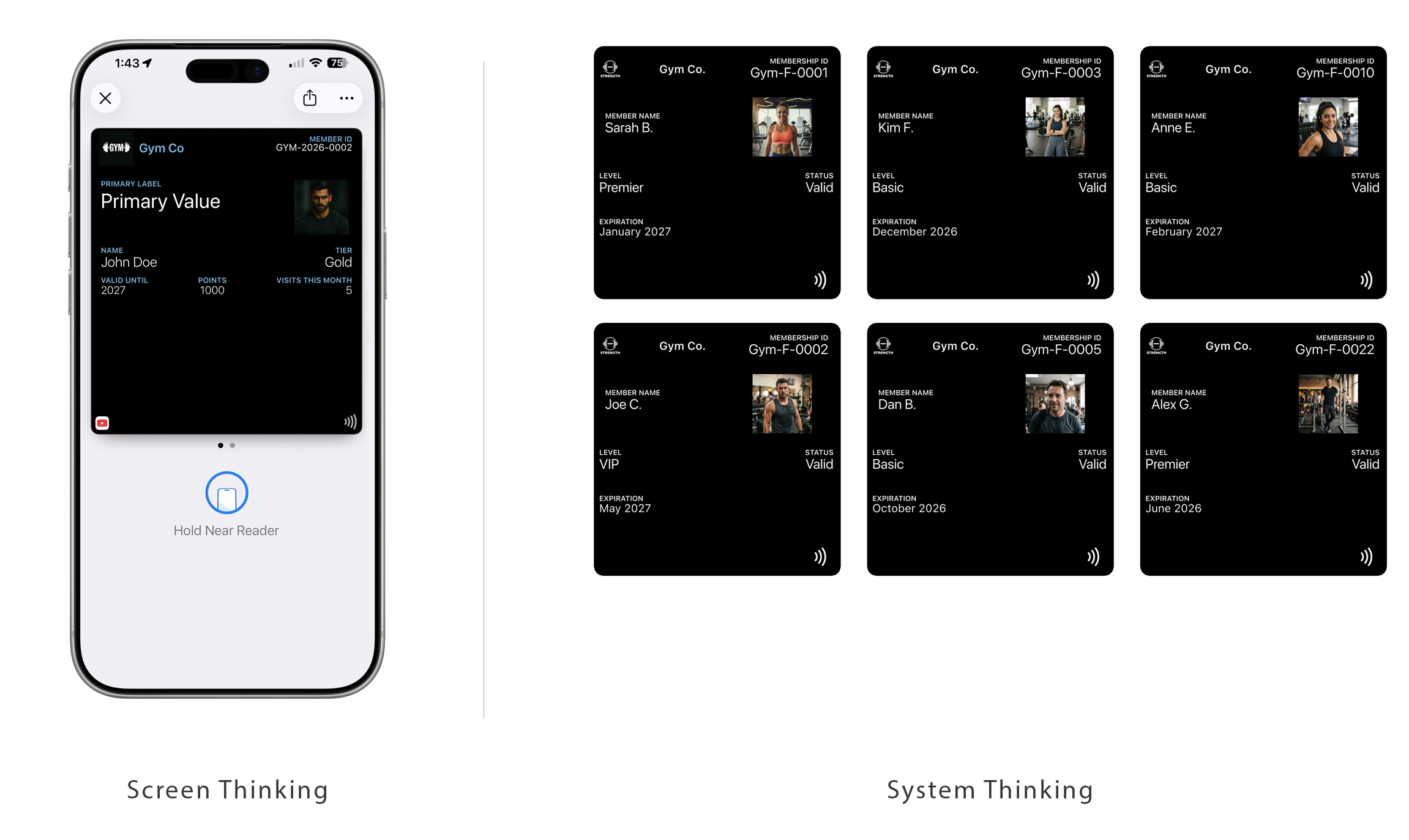
| Screen Thinking | System Thinking |
|---|---|
| Design a layout | Design a structure |
| Optimize for visuals | Optimize for behavior |
| Assume perfect data | Expect variability |
| Control the UI | Define constraints |
| Breaks at scale | Survives at scale |
Platform Reality
This is not just a design philosophy. It is enforced by both Apple Wallet and Google Wallet — in different ways.
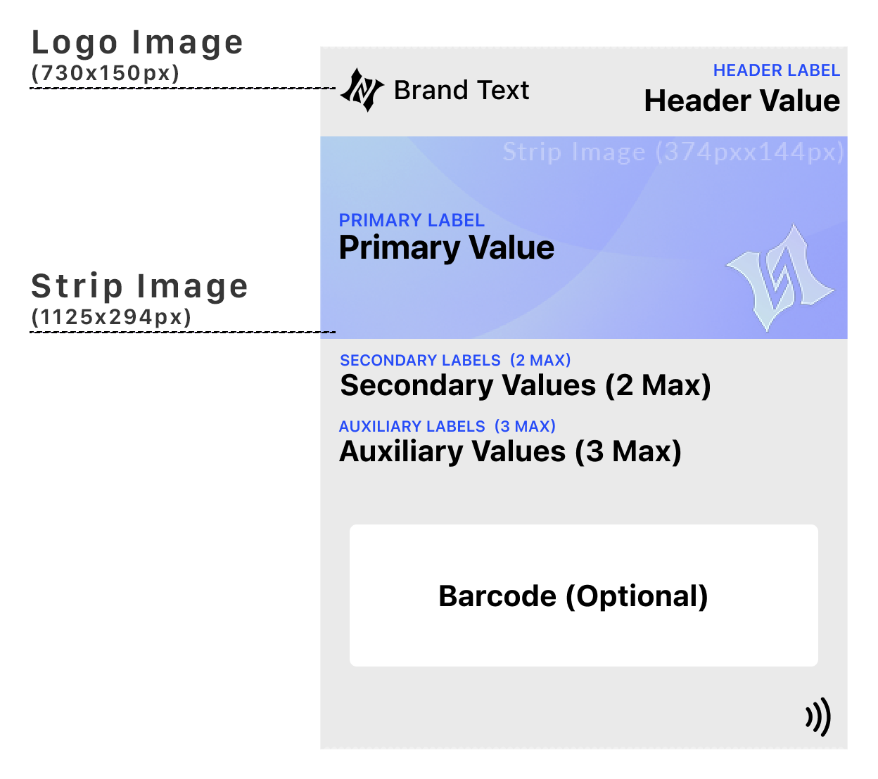
Apple Wallet: The layout is fixed. The structure is strictly enforced. Data fills predefined areas. Each pass follows the same visual rules regardless of device. You are designing within constraints that guarantee consistency.
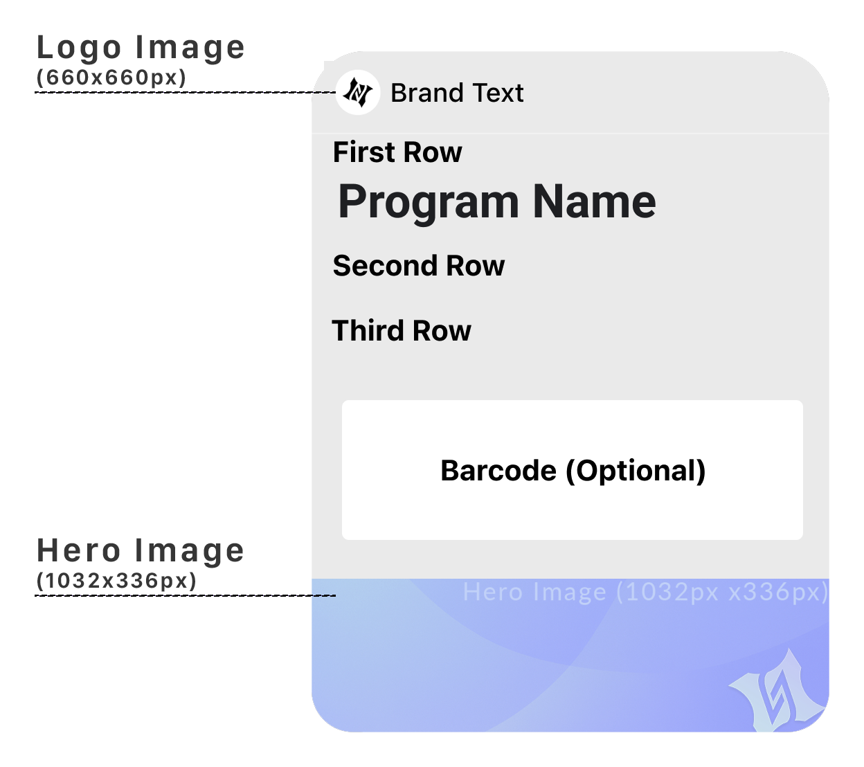
Google Wallet: You define the template once (Google calls this a "Class"). The data changes dynamically. The layout adapts depending on device and context. You are designing a system that will be rendered differently across environments.
You define the data. The system defines the layout.
Apple enforces it. Google adapts it.
Either way: You are designing constraints — not screens.
The System You're About to Learn
Designing wallet passes is not one problem.
It is five different systems — and each behaves differently:
- Constraint: Event Tickets
- Presence: Loyalty
- Timing: Coupons
- Trust: Access & Identity
- Experience: Poster Tickets
Each requires a different design approach.
Most teams fail because they apply the same thinking to all of them.
The Shift
Stop designing layouts. Start designing structures.
Stop optimizing for appearance. Start optimizing for behavior.
You don't design what the user sees. You design what the system can survive.
And most designs don't survive.
More articles in Foundations
Most teams design wallet passes wrong. Not because they lack skill — because they bring the wrong...
Designing for Pass UpdatesA customer just made a purchase. They open their wallet. The loyalty balance is the same as yeste...
How Wallet Passes Are Surfaced by the OSA wallet pass that's never surfaced is a wallet pass that doesn't exist.
Information Hierarchy in Wallet PassesYou have one second.
Interaction Design in Wallet PassesIn wallet passes, interaction design is not about what users do. It's about what the system does ...
Wallet Pass Design LimitationsConstraints are not limitations. They are the design system.
Wallet Pass Design Principles ChecklistEvery failed wallet pass violates one of these principles. Every successful pass embodies them.
Wallet Passes vs Apps vs WebsitesApps invite exploration. Websites enable discovery. Wallet passes demand instant recognition.