

Updated October 5, 2026
TL;DR: Poster Generic creates full-screen, immersive passes.
- Poster Generic is a new pass layout for iOS 27+ with full-bleed artwork
- Ideal for memberships, IDs, badges, and loyalty cards
- Uses a frosted glass footer bar over the artwork
- Supports up to 3 primary fields + 1 footer field
- Supports Featured Actions (11 of 14 types) and Additional Info
- Include a Generic fallback for iOS 26 and earlier
Overview
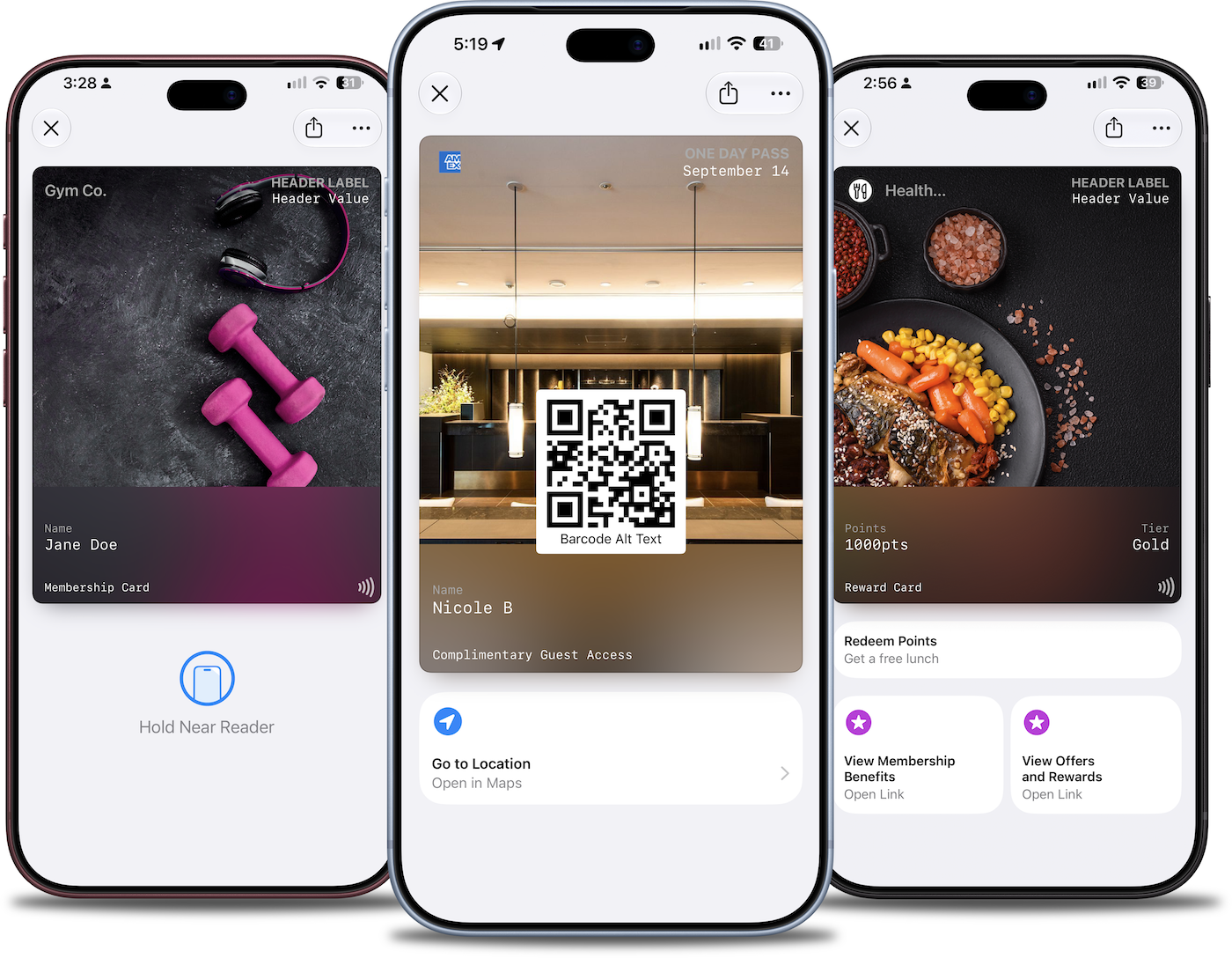
iOS 27 introduces Poster Generic — a visually immersive pass layout that transforms standard membership cards, IDs, and badges into full-screen experiences. Unlike traditional passes with small header images, Poster Generic uses edge-to-edge artwork with content overlaid on top.
This guide covers the Poster Generic layout anatomy, design requirements, supported features, and best practices for creating passes that look stunning on iOS 27+ while remaining compatible with earlier iOS versions.
What is Poster Generic
Poster Generic is a variant of the Generic pass type that uses the posterGeneric key in the pass JSON. It displays:
- Full-bleed background artwork covering the entire pass face
- A frosted glass footer bar with primary fields and metadata
- Header content overlaid on the top of the artwork
- Optional barcode floating over the artwork
The layout creates a premium, poster-like appearance — similar to how concert tickets or movie passes look in Apple's own apps.
When to Use Poster Generic
Poster Generic works best for passes where visual branding matters:
| Use Case | Why Poster Generic |
|---|---|
| Membership cards | Showcase brand imagery with member details in the footer |
| Gym/fitness passes | Display motivational imagery with member ID |
| Hotel key cards | Feature property photography with room details |
| Employee badges | Show company branding with employee info |
| VIP access passes | Create premium, exclusive feel |
| Gift cards | Display branded artwork with balance info |
When to use standard Generic instead:
- Passes that need multiple secondary/auxiliary fields
- Utility-focused passes where data density matters more than visuals
- Passes primarily used for NFC/barcode scanning without branding emphasis
Layout Anatomy
Background Artwork
The artwork image fills the entire pass face. It should be:
- Dimensions: 1170 x 1560 pixels (3x scale for Retina)
- Format: PNG or JPEG
- Aspect ratio: Approximately 3:4
- File size: Under 1MB recommended
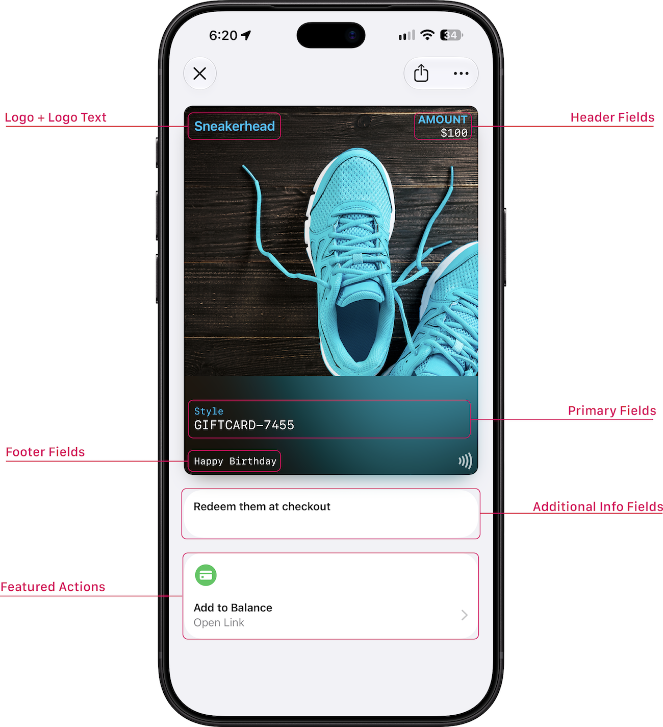
Header Area
The header appears at the top of the pass with:
- Logo (left side) — Your brand mark
- Logo text (left side) — Brand name next to the logo
- Header field (right side) — One label/value pair
The header sits over the artwork, so use the header darkening gradient (enabled by default) to ensure readability on light backgrounds.
Footer Bar
The footer is a frosted glass bar at the bottom that displays:
- Up to 3 primary fields — Label/value pairs in a horizontal row
- 1 footer field — A tagline or supplementary text below the primary fields
- NFC icon (optional) — Appears when NFC is enabled
The blur effect samples colors from the underlying artwork, creating a tinted glass appearance that integrates with your imagery.
Field Layout
| Field Area | Max Fields | Purpose |
|---|---|---|
| Header | 1 | Member ID, status, or tier |
| Primary | 3 | Key information (name, points, expiry) |
| Footer | 1 | Tagline, slogan, or call-to-action |
| Back | Multiple | Terms, contact info, detailed content |
Note: Poster Generic does not use secondary or auxiliary fields. Use primary fields for key information and back fields for details.
Color Configuration
Automatic vs Manual Colors
Poster Generic supports automatic color extraction from the background image. When enabled, iOS analyzes the artwork and selects appropriate text colors.
For manual control, configure:
| Color | Purpose | Recommendation |
|---|---|---|
| Foreground | Primary text (values) | White for dark artwork, black for light |
| Label | Secondary text (labels) | Slightly transparent version of foreground |
| Background | Fallback if no artwork | Matches brand color |
Header Darkening
The header darkening gradient adds a subtle shadow behind the header content, improving readability on light or busy backgrounds. It's enabled by default but can be disabled for dark, solid-color backgrounds.
Featured Actions Support
Poster Generic supports 11 of 14 Featured Action types — the same set available to standard Generic passes. Event-specific actions (viewSchedule, watchTrailer, listenToMusic) are not available.
| Action | Supported | Use Case |
|---|---|---|
call | ✓ | Call member services |
place | ✓ | Navigate to location |
shop | ✓ | Open online store |
order | ✓ | Order food or services |
addToBalance | ✓ | Reload gift card or credits |
membershipBenefits | ✓ | View membership perks |
viewOffersRewards | ✓ | Check available rewards |
bookAppointment | ✓ | Schedule services |
bookCar | ✓ | Reserve rental car |
bookFlight | ✓ | Book flights |
bookStay | ✓ | Reserve accommodations |
See the Featured Actions guide for input formats and implementation details.
Additional Info Support
Poster Generic supports Additional Info fields — the supplementary content area that appears below the pass on iOS 27+.
Use Additional Info for:
- Status labels ("Gold Member", "VIP")
- Short identifiers (confirmation codes)
- Expiration notices
Note: Additional Info fields are static text. For tappable links or phone numbers, use back fields with data detectors.
Backward Compatibility
Poster Generic requires iOS 27 or later. For users on iOS 26 and earlier, include a Generic fallback in your pass.
PassNinja automatically includes both layouts when you create a Poster Generic pass:
{
  "posterGeneric": {
    "headerFields": [...],
    "primaryFields": [...],
    "footerFields": [...]
  },
  "generic": {
    "headerFields": [...],
    "primaryFields": [...],
    "secondaryFields": [...],
    "auxiliaryFields": [...]
  }
}
iOS automatically selects the appropriate layout based on the device's OS version.
Design Best Practices
Artwork Guidelines
Use high-quality imagery — The artwork is the hero element. Blurry or pixelated images diminish the premium feel.
Keep focal points centered — Important visual elements should be in the center or upper portion. The footer bar covers the bottom 25-30%.
Test with different content lengths — Verify that your artwork looks good with short and long field values.
Consider the frosted footer — The blur effect samples colors from the artwork. Busy or high-contrast images near the bottom may create visual noise in the footer.
Typography Guidelines
Keep labels short — Labels appear in small caps. "MEMBER ID" works better than "MEMBERSHIP IDENTIFICATION NUMBER".
Use concise values — Primary field values should be scannable. Long text will be truncated.
Footer text is for taglines — Use the footer field for a short, memorable phrase, not critical information.
Color Guidelines
Ensure contrast — Text must be readable over the artwork. Use header darkening for light backgrounds.
Match label color to the mood — Slightly transparent white labels work well on dark, moody artwork. Dark labels work on bright, colorful artwork.
Test automatic colors — If using automatic color extraction, verify results with your specific artwork.
Technical Implementation
PassNinja Dashboard
- Create a new Apple pass template
- Select Generic as the pass type
- Enable Advanced Mode to access Poster Generic fields
- Upload your background artwork
- Configure header, primary, and footer fields
- Add Featured Actions if desired
PassNinja API
Create a Poster Generic pass using the standard pass creation endpoint. The template configuration determines whether Poster Generic fields are used.
curl -X POST https://api.passninja.com/v1/passes \
  -H "x-api-key: YOUR_API_KEY" \
  -H "x-account-id: aid_0x123" \
  -H "Content-Type: application/json" \
  -d '{
    "passType": "ptk_XYZ",
    "pass": {
      "member.name": "Jane Smith",
      "member.id": "MEM-123456",
      "membership.type": "Gold Member",
      "footer.tagline": "Experience the difference"
    }
  }'
Field names depend on your template configuration. Check your template's field schema via the dashboard or API.
Summary
Poster Generic brings full-screen, immersive design to membership cards and IDs. By leveraging bold artwork, a frosted glass footer, and iOS 27's Featured Actions, you can create passes that feel native to Apple's premium design language.
| Key Point | Detail |
|---|---|
| Minimum iOS version | iOS 27 |
| Artwork dimensions | 1170 x 1560 px (3x) |
| Primary fields | Up to 3 |
| Footer fields | 1 |
| Featured Actions | 11 types supported (2 max per pass) |
| Backward compatibility | Generic fallback for iOS 26 and earlier |
More articles in Platform Guides
Every design difference between Apple and Google Wallet traces back to one choice:
Apple Wallet Design System ExplainedApple Wallet is not a design tool. It is a policy engine.
Apple Wallet Layout AnatomyLayout in Apple Wallet is semantic, not spatial.
Designing Apple Wallet Passes: Text Alignment, Layout, and BehaviorYou cannot control how text looks in Apple Wallet. You can only control what it says.
Designing One Pass for Two PlatformsDesigning one pass for two platforms sounds efficient. It's actually one of the hardest problems ...
Google Wallet Design System ExplainedGoogle Wallet doesn't hold credentials. It connects systems.
Google Wallet Layout Behavior & Visual FlexibilityGoogle Wallet's flexibility is not an invitation to design freely. Flexibility demands defensive ...
iOS 27 Featured Actions and Additional InfoiOS 27 introduces **Featured Actions** — tappable action buttons displayed prominently on the fro...