
Updated March 26, 2026
TL;DR: Google Wallet's flexibility is not an invitation to design freely. Flexibility demands defensive design.
- Layout adapts dynamically — precision positioning will not hold
- Images may be resized, cropped, or deprioritized unpredictably
- Passes look different across devices, OS versions, and OEMs
- Text hierarchy matters more than visual richness
- The question isn't "how do I make this look right?" — it's "does this survive looking different?"
- Reliable design outperforms precise design every time
Overview
Google Wallet's flexibility is not an invitation to design freely. Flexibility demands defensive design.
Images may resize. Layouts may adapt. Text may truncate differently across devices. What looks perfect on your test phone may look wrong on half your users' phones.
The question isn't "how do I make this look right?" The question is "does this survive looking different?"
Why flexibility is not freedom
Teams hear "Google Wallet is more flexible" and expect more control. They're wrong.
Apple gives you less control but more predictability. Google gives you more options but less certainty.
On Apple, your design will look exactly like this on every device. On Google, your design will look approximately like this on most devices.
Which is harder to design for? The one with variance. Flexibility demands defensive design.
For the underlying philosophy driving these behaviors, see Google Wallet Design System Explained.
What happens at render time
Google Wallet does not enforce a rigid, region-based layout. Instead, layout is resolved dynamically based on pass type (Google calls this a "Class"), field data, device screen size, OS version, and OEM implementation.
You are not designing a fixed screen. You are designing a data model that will be rendered differently across surfaces.
Consequence: Designs that assume exact positioning will break. Designs that assume meaning survives reflow will succeed.
Why images are optional, not structural
In Google Wallet, every image might:
- Scale to a different size than you expected
- Crop differently than your mockup showed
- Appear more or less prominent than on your test device
- Be deprioritized entirely on some OS versions
This isn't a bug. It's the system trading visual consistency for ecosystem reach.
The test: Remove every image from your pass. Is the pass still understandable? If not, your design is fragile.
Consequence: Providing a correctly sized image does not guarantee a consistent visual result.
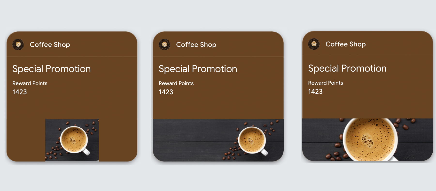
The following example shows how the same hero image renders differently across device sizes — notice how proportions shift and edge content may be cropped:
Google Wallet Image Specifications
| Image Type | Dimensions | Aspect Ratio | Notes |
|---|---|---|---|
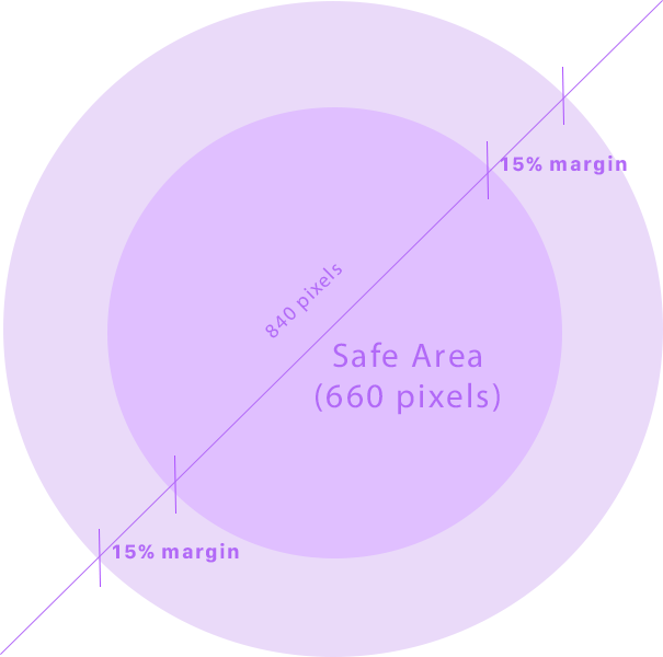
| Logo | 660 x 660 (max 840x840) | 1:1 (square) | Auto-circular masked — 15% safety margin required |
| Hero Image | 1032 x 336 | 3:1 (landscape) | 60px edge buffer recommended |
File Format: PNG or JPG accepted
Google Wallet automatically applies a circular mask to logos. Keep critical content within the inner 70% to avoid clipping:
How to design images that survive
Instead of asking "How do I optimize this image?", ask: "Does this image survive being resized, cropped, or deprioritized?"
- Never encode meaning only in images
- Avoid text inside images
- Expect images to be resized unpredictably
- Use imagery to reinforce recognition, not convey instructions
- Ensure the pass remains understandable if the image is minimized or removed
Test: If removing the image breaks comprehension, the design is fragile.
Why text hierarchy still matters most
Despite greater visual freedom, users scan Google Wallet passes the same way they scan any pass: top to bottom, primary value first, context second, details last.
Visual flexibility does not change human perception.
Designs that overemphasize imagery at the expense of text clarity often perform worse, even if they look richer.
Why passes look different than expected
Teams commonly report:
- "It looked fine on my phone"
- "The image is too big or too small"
- "Apple looks consistent, Google doesn't"
This is not a bug. It is the result of adaptive layout resolution, OEM-level rendering differences, and platform prioritization of data over decoration.
Google Wallet rewards structured design, not precise design.
| Dimension | Apple Wallet | Google Wallet |
|---|---|---|
| Layout rigidity | High | Low |
| Visual predictability | Very high | Variable |
| Image tolerance | Strict | Flexible |
| Cross-device consistency | Strong | Weaker |
| Design strategy | Structural | Adaptive |
What is fixed vs customizable per-pass
Google Wallet separates pass content into two layers: template-level fields (fixed for all passes using that template) and per-pass fields (customizable for each individual pass).
Understanding this split determines what can change between passes and what requires a new template.
Template-level fields (locked once created)
| Pass Type | Fixed at Template Level |
|---|---|
| Offer | Issuer name, title, provider, redemption channel, fine print, details, hero image, logo |
| Loyalty | Issuer name, program name, field labels, rewards tier label, program logo, hero image |
| Event Ticket | Issuer name, event name, venue name, venue address, date/time, hero image, logo |
| Generic | Layout template, hero image, logo |
Per-pass fields (customizable)
| Pass Type | Customizable Per-Pass |
|---|---|
| Offer | Barcode, valid time interval, locations, pass state |
| Loyalty | Account name, account ID, loyalty points, secondary points, barcode |
| Event Ticket | Seat info (gate, section, row, seat), barcode, pass state |
| Generic | Card title, header, subheader, text content, barcode |
Event Tickets are the most restricted
Cannot change per-ticket: Event name, event date/time, venue name, venue address, hero image, logo
Can change per-ticket: Seat information (gate, section, row, seat), barcode value, pass state
Practical impact: Different events require different templates. You cannot reuse a template across events — only seat assignments and barcodes vary within the same event.
When flexibility helps vs hurts
Flexibility helps with:
- Brand-forward passes
- Campaign-oriented passes
- Situations where visual differentiation matters more than precision
- Broad Android device support requirements
Flexibility hurts with:
- Passes requiring exact alignment
- Designs relying on imagery for meaning
- Highly regulated or validation-critical use cases
Neither approach is better — they serve different platform goals.
The real difference from Apple
Apple says: "Here are the rules. Follow them exactly." Google says: "Here are the guidelines. Expect variance."
Designers trained on Apple expect enforcement. Google offers adaptation instead. The same design that works on Apple may fail on Google — not because it's wrong, but because Google doesn't guarantee the same rendering.
Design for Apple Wallet like you're following a contract. Design for Google Wallet like you're building for unknown screen sizes.
The Shift
Stop optimizing for perfect rendering. Start optimizing for reliable meaning.
On Google Wallet, the pass that looks identical everywhere doesn't exist. The pass that feels consistently understandable everywhere does.
Design for meaning, not pixels. The meaning survives. The pixels don't.
More articles in Platform Guides
Every design difference between Apple and Google Wallet traces back to one choice:
Apple Wallet Design System ExplainedApple Wallet is not a design tool. It is a policy engine.
Apple Wallet Layout AnatomyLayout in Apple Wallet is semantic, not spatial.
Designing Apple Wallet Passes: Text Alignment, Layout, and BehaviorYou cannot control how text looks in Apple Wallet. You can only control what it says.
Designing One Pass for Two PlatformsDesigning one pass for two platforms sounds efficient. It's actually one of the hardest problems ...
Google Wallet Design System ExplainedGoogle Wallet doesn't hold credentials. It connects systems.